how to position temperature sensors
there are mistakes to avoid when using measurements to control thermal comfort ...
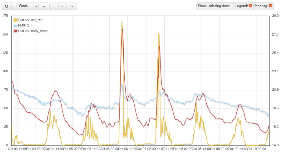
The positioning of the sensors is quite sensitive and you have to start with simple things.
On the graph, the red curve represents the temperature near the window: when the sun shines (watch the radiation captured by the pyranometer, in yellow), the temperature rises quickly and during the night, the effect of the outside cold is very significant.
The blue curve is measured with a thermocouple positioned on a table, in the middle of the room. The measurement of this thermocouple is much more representative.